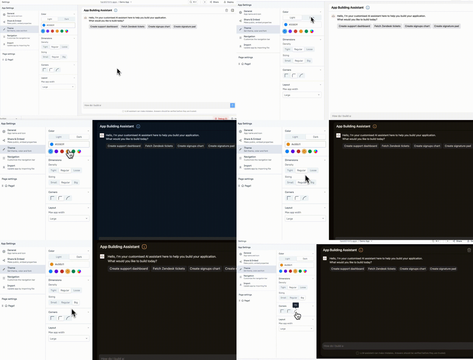
Theme (AI Assistant)
This page provides information on app theme settings (available on Appsmith apps), which allows you to customize the appearance of your app. You can update widget colors, change font styles, and adjust border/shadow effects.

Color
The Color settings allow you to customize the visual style of your app by adjusting the overall color scheme. These properties help create a consistent and branded look across your app by defining the primary and accent colors.
Theme
Choose between Light and Dark themes to adjust the overall color scheme of your app. The Light theme offers a brighter design with lighter backgrounds and darker text, while the Dark theme provides a darker background with white text for a more modern, contrasting look.
Accent Color
This property allows you to set the accent color for your app. You can choose from the predefined color options or input a custom hex code to match your branding. The accent color is applied to key elements like buttons, links, and highlights, creating a unified theme throughout your app.
Dimension
The Dimension settings allow you to control the spacing, sizing, and corner rounding of your app’s elements, helping you fine-tune the layout for better user experience and design consistency.
Density
This property controls the spacing between elements in your app:
- Tight: Reduces spacing between elements for a compact, more dense layout.
- Regular: The default setting, providing standard spacing for a balanced layout.
- Loose: Increases spacing between elements for a spacious, open layout.
Sizing
Adjust the size of elements throughout your app using the following options:
- Small: Reduces the size of text and widgets for a more minimalistic and compact design.
- Regular: The default size setting, offering a standard layout.
- Big: Increases the size of text and widgets for a more prominent, easy-to-read design.
Corner
The Corner settings allow you to control the roundness of widget corners, providing a more polished and modern look:
- Sharp: No rounding, maintaining sharp corners for a more angular, clean design.
- Medium: Slightly rounded corners for a softer, yet still defined look.
- Rounded: Applies fully rounded corners to widgets, giving them a smooth and modern look that improves the overall visual design of your app.
Layout
The Layout properties allow you to control the overall structure and width of your app, ensuring it adapts to different screen sizes and provides a consistent user experience across devices.
Max App Width
This property lets you define the maximum width of your app layout, helping you control how your app appears on larger screens. You can choose from the following options:
- Unlimited: The app stretches to fill the entire screen width.
- Large: A wider layout, ideal for displaying more content.
- Medium: A balanced width, providing a good fit for most use cases.